AT&T
AT&T
Improving the product and promotional campaign planning execution, within a single application
User Research · Feedback Analysis · User Flows · Wireframing
You can view the complete wireframe decks below
Master Deck 1
Master Deck 2
Design Canvas: Retail Marketing
Strategy Canvas: Retail Marketing
User dashboard
I worked with One Door's development team to create the user interface and experience for AT&T’s Planning Cloud to improve the product and promotional campaign planning execution, all within a single application.
This real-time application creates a uniform experience for store managers for all tasks and communication during planning, executing, and tracking product and promotional campaigns. Completion of each task, fixture, and campaign is measurable at any time. Planning Cloud also enables users to localize their products and promotions based on demographics and store configurations.
Campaign planning screen - card view
Campaign planning screen - list (detail) view
My biggest challenge was to create a simple, friendly, and repeatable campaign planning process while keeping the complex information and data models hierarchical and dynamic. Working with real users from the beginning gave us insights into the users’ needs, while each product demo kept the focus on iterating and delivering the most precise interface for such an involved process. We designed four similar experiences for four different user groups. Creating a well-defined and integrated design system helped us during wireframing and visual design.
Building user workflows helped to address every possible user scenario in Planning Cloud. Starting with whiteboards, markers, and lots of arrows, we sketched out the entire system. Later, we transferred this diagram to Sketch before the team walkthroughs.
Retail marketing
DESIGN PROCESS
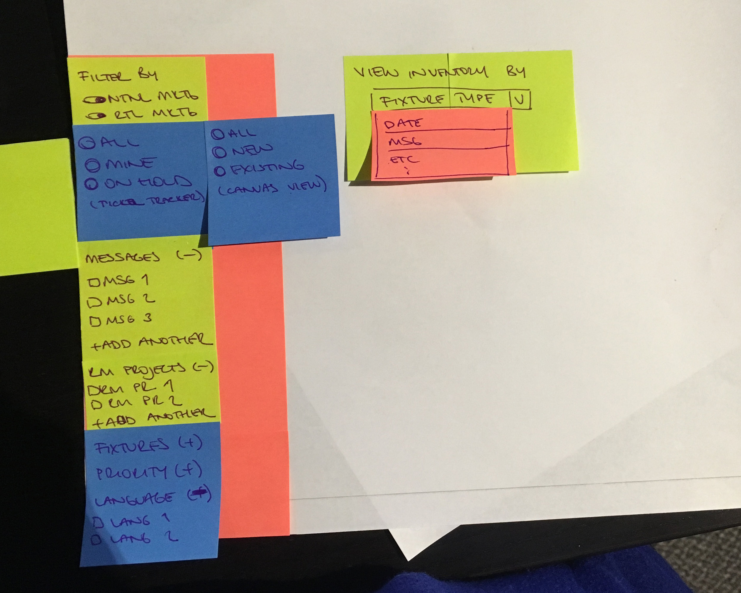
With this client, our research included dashboard design and iconography, font pairings, and color schemes. We compiled moodboards combining our recommendations with client expectations. Do not think of these as strict guidelines, but a prompt for discussion on what the product will feel like. The sketching and conceptualizing process begins with these discussions. Once everything is on paper or on screen and applied to wireframes, it is easier to start iterating around a visual system. I also believe in the importance of documenting the worst-case scenarios with annotated key screens and elements. These edge cases are later combined with a style guide, which is a valuable resource for the development process.
Final design of campaign planning screen
Sketching out user workflow on whiteboard with client
Sketching out user workflow on whiteboard with client
Paper prototyping
User workflow


